With Station A Card, our goal is to make clean energy transparent to everyone, while addressing the major pain points of clean energy development itself: fragmented data, limited software, and broken development workflows.
🧩 Clean energy data is fragmented
Planning and designing a clean energy project, such as a rooftop solar system or an on-site battery system, requires a lot of data. A typical clean energy developer today looks at 4 categories of data to determine project feasibility:
- Location Data: building size, parcel size, local solar insolation levels, etc.
- Occupant Data: name, business type, credit score, hours of operation, etc.
- Energy Data: annual peak demand, annual energy usage, etc.
- Grid Data: utility tariffs, incentive programs, integration capacity levels, etc.
This data is fragmented across real estate databases, utility bills, and meter reading spreadsheets.
The unfortunate outcome of this fragmentation is that the data is unlinked from its context: a building record in a real estate database is only partially helpful if you don’t know what its energy usage patterns look like, a utility bill is useless if you don’t know which location it refers to, and a meter reading is irrelevant if you don’t know how much electricity costs at that meter.
🛑 Clean energy software is limited
The clean energy software landscape today offers a lot of tools to process this data. There is a slew of solar design tools that can take in location data and produce solar designs, battery dispatch optimizers that can take in energy data and produce battery operations curves, and even utility data access tools that can take in utility account credentials and produce well-structured energy usage data.
Clean energy developers today work with mostly contextless input/output software tools. A user inputs data and the application enriches and outputs that data. A typical developer today uses 5-10 different applications and some of our users have mentioned that they pay more for hacky software integrations than software licenses in aggregate.
In a lot of ways, these contextless tools reflect and compound the data fragmentation. You can have the most accurate solar design tool, but that won’t matter if the utility tariff in your region makes solar cost-prohibitive. Similarly, you can have the best battery dispatch optimizer, but that won’t matter if the grid’s integration capacity at your interconnection point makes batteries impossible.
💔 Development workflows are broken
At Station A, we are intimately familiar with clean energy developers’ day-to-day workflows. Based on our experience, a typical clean energy development workflow today involves the following steps:
- Identifying the source of the data (e.g. a real estate database)
- Applying some filtering criteria (e.g. the region you are targeting)
- Downloading all or some of the data in some format (e.g. as a .csv or .xlsx file)
- Trying to match it against the rest of the information about your project (e.g. addresses of your existing customers in that region stored in Salesforce)
- Producing a synthesized output (e.g. a report or proposal to share with a customer)
Our users have reported 3 major flaws with their development workflow today:
Constant back-and-forth
The development workflow today is sequential, which means that a tiny revision at an early step necessitates re-evaluating a project from the beginning. This happens a lot: in most projects, assumptions and inputs are revised tens or even hundreds of times before a contract is signed. This could include refreshing the energy data, correcting the escalation rate for a P.P.A., or redrawing the deployable area for solar.
We need data-reactive workflows that reflect the dynamic nature of the development process.
Data becomes stale
The data involved in the development workflow today is always changing: utility tariff rates update frequently, new products become available, new buildings get built, and new incentive programs pop-up in the market. Given that project origination and analysis usually takes months, developers relying on data generated early in the lifecycle of a project might have an outdated view when “boots hit the ground.”
We need always-on tools that constantly evaluate buildings and try to discover new projects on a daily, or even hourly basis.
Data loses its context
The most common actions in the development workflow today are “exporting” and “importing” information from one step to the next. In a lot of ways, an ever-expanding spreadsheet is the “connective tissue” of most workflows. A spreadsheet downloaded onto a user’s hard drive is unlinked from its context: the information it relies on, the assumptions that went into it, and the sources that were used to produce it.
We need contextualized data, with transparent assumptions and traceable sources.
💰 As a result, soft costs are astronomical
The current state of clean energy data, software, and workflows exaggerates the immensely high soft costs that prohibit scale in the clean energy market. What is really missing is a global view into the data and functionality needed to develop clean energy. Not necessarily a new software tool to replace all software tools, but a solution that links data, integrates with any tool, and reflects the dynamic nature of the development process.
🪄 Why Station A Card?
The Station A Card, available as a pre-release today, is built with 3 key qualities:
Plug-and-Play
The Station A Card is designed to easily integrate into any website, customer portal, or CRM. With just one line of code, any user, regardless of software proficiency level, can bring Station A data and insights into their workflow in seconds.
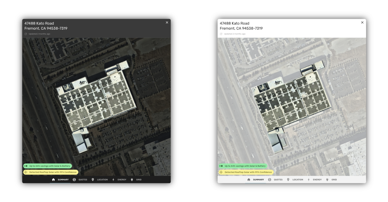 Personalizing the appearance of the Station A Card using themes.
To make Station A “pluggable”, we first considered building an API product. For our customers, writing an API integration is time-consuming and requires a decent amount of software development skills. On top of that, keeping an API integration up-to-date with the latest request and response schemas is painful and expensive, especially when working with multiple data providers.
Offering a product that internally handles data requests and responses, means we can keep iterating on our data schemas (e.g. adding new data fields, enriching existing data fields) without disrupting the workflows of our users. This level of integration flexibility is critical for a company of our stage, and something we wouldn’t have with an API product.
Always-on
The Station A Card data and insights are refreshed every second since they remain linked to the broader body of Station A information.
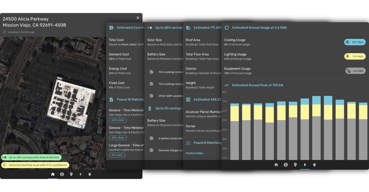 Exploring data about a building in Southern California through the Station A Card.
This means that individual data fields, such as the occupant of a building, the local electricity costs, and the available incentive programs are always up-to-date. It also means that synthetic data fields, such as the estimated annual peak demand, the likely utility tariff, and the estimated bill savings with solar are recomputed every second using the latest Station A Machine Learning models.
As the Station A Platform evolves, the data and functionality of the Station A Card will evolve alongside it as well, with zero maintenance work for the Card’s integrators. Over time, our users will experience new data fields (e.g. GHG emission reductions), new clean energy product models (e.g. EV chargers), and new features (e.g. requesting market pricing for clean energy products) in their Station A Cards automatically.
Context-aware
The Station A Card uses Machine Learning to read and respond to its context.
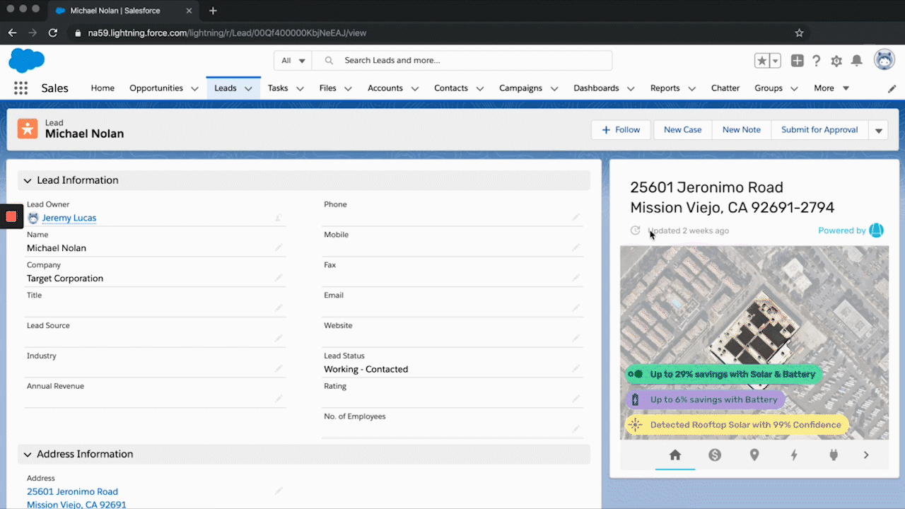 Using the Station A Card in Salesforce
It reads its context, such as information present in the web page it is embedded in, and uses this information to decide which content to display. For example, the pre-release of the Station A Card uses a Salesforce record’s location address to display a full Station A analysis for that location.
The richer the context, the better the data and functionality the Station A Card provides. For example, if a Salesforce record includes a location’s annual energy usage, the Card can learn from this additional information to improve the accuracy of its clean energy recommendations. The Card can also learn from a user’s Station A preferences and history (e.g. favorite geographies, most commonly analyzed building types) to further personalize its content.
🔑 Context is the key
We believe that context is the key to unlocking the clean energy market: new development workflows that use contextualized data to increase transparency, and context-aware software to improve efficiency and enable scale. That’s how we drive soft costs down to zero. The Station A Card is our first step in this direction.
If you would like to learn more about the Station A Card pre-release and receive integration instructions, reach out to support@stationa.com.